When I first started performing with the Denver Concert Band, they had a website that served them well, but they wanted something to better reflect their status a professional and modern group of musicians. This is their original design:
When I first started performing with the Denver Concert Band, they had a website that served them well, but they wanted something to better reflect their status a professional and modern group of musicians. This is their original design:
When I first started performing with the Denver Concert Band, they had a website that served them well, but they wanted something to better reflect their status a professional and modern group of musicians. This is their original design:
A Front-to-Back Process
I took a UI/UX Certification course through Boulder Digital Arts, and I was able to design a mobile app, step-by-step, through the entire UX process.
.jpg)
Requirements
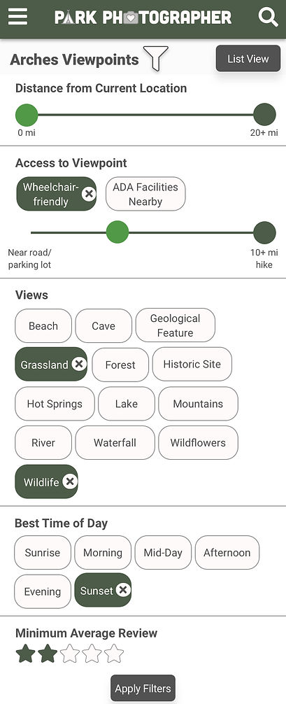
User story: As a photographer visiting a USA National Park, I would like an app that can help me find viewpoints based on my search criteria.
Requirements:
-
Select a national park
-
See viewpoints on a map
-
See viewpoints on a list view
-
Filter/refine list of viewpoints based on criteria
-
Search for a specific viewpoint
-
Read a viewpoint description
-
View viewpoint pictures
-
Read viewpoint reviews
-
Upload review
-
Save/favorite a viewpoint
Personas
Before diving into this project, I first needed to determine: who are my users? I created Robert and Emily based on real photographers I've met.
I vetted each stage of my designs against these personas. Would they be able to use the app? Did the app provide the value they are seeking?

.jpg)
User Flow
This project inspired plenty of design ideas that I was eager to explore, but I selected one main user flow that would address all of the requirements and persona needs.

Wireframes
After some initial hand-written sketches, I developed wireframes for each main page.


Usability Testing
I tested 5 of my UX peers to see if the app was intuitive and if they had any pain points. I made a few changes based on the results:
"I think just choosing a park right off the bat on the home page is a little intimidating."
"How do I get back to the map view from the list?"
"Can I leave my own review?"
Sketch Setup and First Hi-Fis
Now for one of my favorite parts of the process: starting the Hi-Fidelity screens. I started by establishing the colors and fonts, referring to my personas for those decisions. I then began building symbols I knew I'd use throughout the app, like the logo and main header.

A/B Testing
After an initial round of Hi-Fis, I was able to A/B Test a couple of my designs with 7 peers.

Should the viewpoint markers show details in:
A. A pop-up near the marker
B. A static window at the bottom of the screen?

Should the viewpoint filters:
A. Display all at once on a full page?
B. Be static on the page, and editable by clicking each button?
Final Hi-Fis
Time for the final designs!
_edited.jpg)


Prototyping
View my final prototype through InVision on a phone or desktop: https://invis.io/38TD3MRCUZ9
Reflections
I had another round of feedback for my prototype, and I compared the designs to my work flow, personas, and requirements.
I learned a lot in this class environment, including what questions to ask, and how to set everything up before the hi-fi stage for easy design logic. While I love every step of this process, I really enjoyed testing and creating the Sketch branding and components.